How to test responsive webdesign on Firefox browser (no add-ons)?
What is a responsive web design?
"Responsive web design (RWD) is an approach to web design aimed at crafting sites to provide an optimal viewing experience—easy reading and navigation with a minimum of resizing, panning, and scrolling—across a wide range of devices (from desktop computer monitors to mobile phones)."
How do know if a website is made Responsive?
Just open the website in a browser on mobile device such as mobile phone or tablets. If the website is rendered so that is fits your device's screen it is. Otherwise, you will see only a partial portion of the website on the device and you might need to scroll to sides to see the end of the page.
Responsive webdesign testing from within Firefox Browser with drag feature
.jpg) Responsive webdesign test tool is already included in Firefox's Developer Tools. There is no need of installing any additional add-ons to enable it.
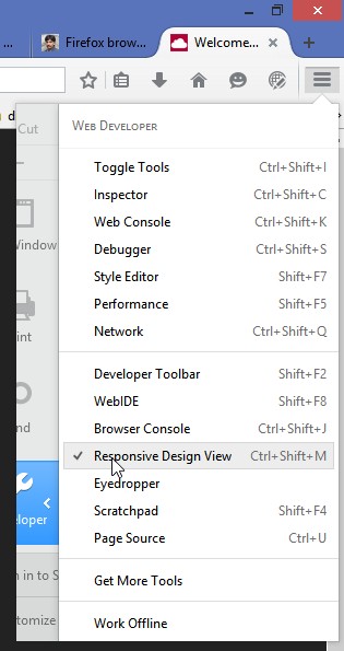
Responsive webdesign test tool is already included in Firefox's Developer Tools. There is no need of installing any additional add-ons to enable it. - Click on the Firefox Menu Icon (top right corner) > Developer (wrench icon) or from Menu bar > Tools > web Developer
- Select select "Responsive Webdesign View"
Hotkey to toggle Responsive Webdesign View:
You can also start "Responsive Webdesign View" in Firefox using the hotkey "CTRL+SHIFT+M".
As you drag you can see the size and the page layout change.
.jpg) |
| Page view at 908x640 |
.jpg) |
| Page view at 374x640 |
If the website does not have a responsive design, then the layout will not change but you will see only a part of the page. You would need to scroll to sides of the screen to see the contents on the sides.


Thanks for introducing about Responsive web design. It's really awesome.
ReplyDeleteResponsive Web Design Company in Indore
Really nice...
ReplyDeleteDrupal Web Design Company in Qatar
Thanks for sharing the useful information with us.. carry on
ReplyDeleteDrupal Web Design Company in Qatar
Great representation. Thanks for sharing information about responsive web design on mozilla. your blog is rich of information.
ReplyDeleteweb design and development company
Responsive Design Mode makes it easy to see how your website or web app will look on different screen sizes. Check this CU Web design hope you will like this.
ReplyDeleteThanks for posting very useful information.
ReplyDeleteIOS app development Qatar
Great lists that really presents at lot of interesting examples. We are currently trying to educate our clients in Responsive Design, and I will add this to a “must read list” :)
ReplyDeleteCado Magenge
App Development Companies Melbourne
Magento Development Company
Responsive Web Design Company Melbourne
The blog was absolutely fantastic! Lot of great information which can be helpful in some or the other way. Keep updating the blog, looking forward for more contents...Great job, keep it up..
ReplyDeleteBangalore Web Design Companies | Website Development Company